Sharpening the visual identity using the pioneering approach of research and visual nudging.
The sustainable battery
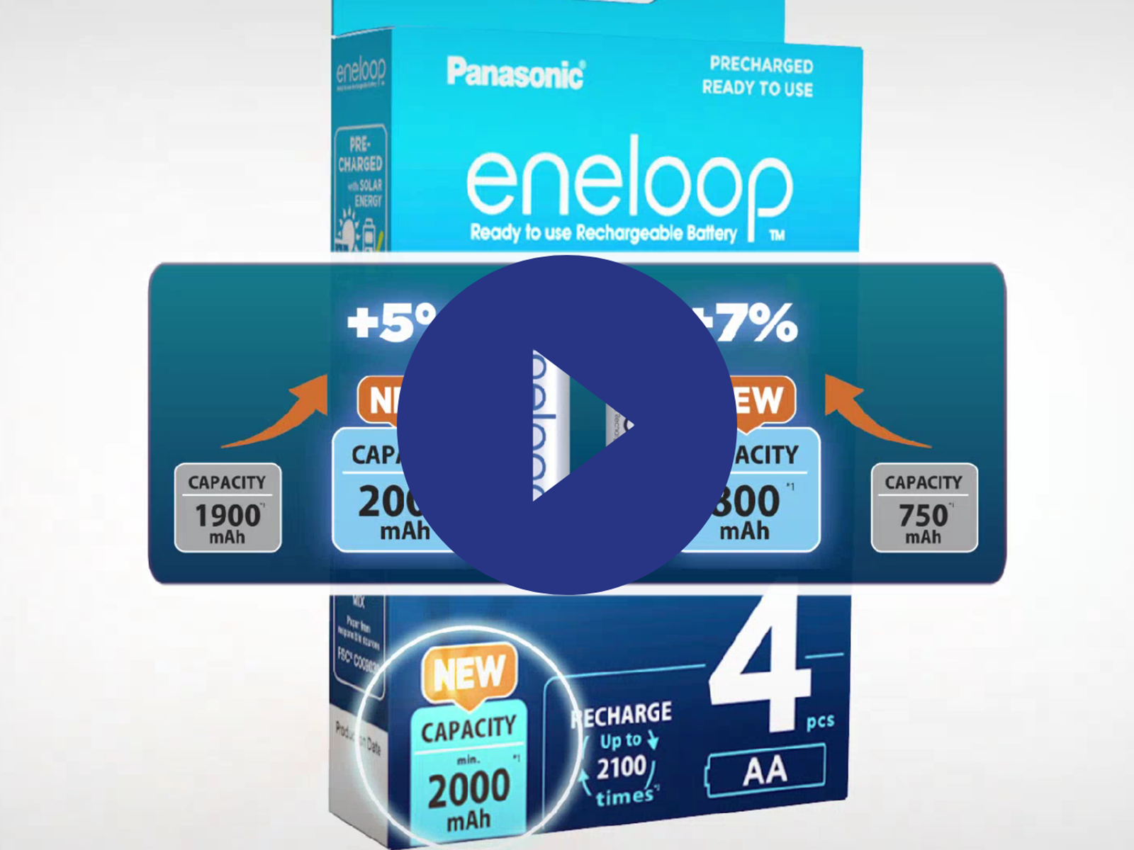
eneloop is the only battery brand that exclusively ships rechargeable batteries to more than 80 countries. It sells several types of batteries and chargers. With its typical Japanese-inspired design, this Advanced Power Solutions (formerly Panasonic) brand is loved by consumers all over the world. eneloop draws the sustainability card and aims to be the next generation in environmentally friendly batteries, opting for the convenience of standard batteries while adding the benefits of rechargeable batteries. So these batteries represent pre-charged, long-life, recyclable, rechargeable batteries that save energy and money.
Some time ago, eneloop came to One Inch Whale with a new challenge. For the launch of its new and plastic-free packaging for its chargers, it wanted to find the right 'jacket' to align with its positioning as a sustainable brand and product. Before launching its new charger packaging effectively, eneloop wanted to validate the performance of its packaging designs directly with consumers. To achieve these goals, One Inch Whale has disrupted the traditional approach to packaging research.
Research approach
Based on the existing and desired brand values, a certified visual colour identity was determined with the scientifically supported Color Navigator tool. Subsequently, the design agency involved started working with this in designing the packaging. In addition, we looked at how the consumer could be better guided in the purchase and usage of the chargers, by determining the crucial claims and product information on the pack. Based on this, the design agency proposed several executions, which we then validated on determining factors such as attention, clarity and the colour success factor via predictive intelligence.
After several iterations, two promising routes remained that took into account some important insights:
- the consistent use of the right icons to communicate product information clearly and intuitively
- determining the right colour tones to communicate the right product and brand associations subconsciously
- creating a relevant hierarchy in the quantity of products and variants
In the next phase, these two options were contextually validated with consumers compared to the current packaging, in different European countries. The study declared a clear winner, which has since had a significant impact on sales results.
Are you interested to know more about this case study? Are you curious how One Inch Whale can help you optimise your packaging and future in a cost-efficient and disruptive way? Feel free to contact us for a conversation.
And in the meantime, check out the eneloop products, buy your rechargeable batteries at www.panasonic-eneloop.eu and discover how you can be part of making the world a better place.