Nobel Prize winner Kahneman has shown that 95% of the decisions we make are rather unconscious, and colour is the dominant factor in 85% of the cases. So when we as consumers assess a brand or product, colour plays a hugely important role. Working with the right colours is the easiest and fastest way to increase a company's results. However, colour is heavily underestimated by the majority of companies. By using the right colour combinations and colour nuances in a brand logo, packaging, website or advertisement, you can generate much more impact and respond to the desire and expectations of the consumer.
For example, Google set up a number of experiments to decide which colour blue to use on advertising links in Google Search and Gmail. As a result, they learned that a somewhat more purple shade of blue was more able to generate more click throughs than a slightly greener shade of blue. This insight and the implementation of the right blue earned the company an additional $200 million in revenue.
Science & research: there is no arguing about colour
Often the use of colour is decided on the basis of what the marketer or graphic designer likes, while today it is more than ever about decision making based on data and insights. And it is important not only to rely on what consumers tell us. No matter how well-intentioned, consumers are often incapable to formulate relevant answers to the questions that companies ask themselves. In addition to consumer research, it is also important to use existing data and knowledge, behavioral economic principles and scientifically substantiated colour expertise. After all, colours can be warm versus cool or activating versus calming, and you can also play with light versus dark. By linking the impact and meaning of colours to other market research data, we get even closer to what consumers think and feel.
Showing true colours with the right consumer insights
The insertion of scientifically based colour expertise is extremely relevant in brand, communication and packaging research. But also when we want to segment consumers or focus on new concepts.
A visual identity that breathes the values of the brand
The first step in developing a strong visual brand identity is to sharpen the "brand purpose", the brand story and the brand values, from consumer insights and macro trends. In order to determine the visual identity, brands often focus on the main colours of their brand or logo. For example, ING predominantly uses orange in its communication, and Belfius uses deep pink. In addition to the main colours, however, there is a whole pallet of context colours that, from the scientifically substantiated colour database with almost 10,000 colour nuances, can be used in visual communication. Bebat's example shows that in addition to the two brand main colours, a wide range of context colours can be used in communication that have the same load of brand values.
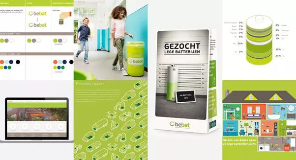
Customer case Bebat. In addition to main colours of the brand, there is a whole pallet of context colours that support the brand values and identity.
The main and context colours are chosen based on the emotional charge and associations that these colours generate on a subconscious level, and of course also align with the values of the brand. Result: a higher impact on consumer behaviour.
Enriching communication & packaging research
The same applies to communication and packaging research where, in addition to the exploration of the desired message or tone-of-voice, we will also determine which visual colour identity must be attached to this in order to increase the performance and conversion of all touchpoints. Here, too, it comes down to guiding people from unconscious choice processes to a certain behavior through colour and the associated associations.
A colour audit of an existing packaging often shows that there is room for improvement, and not all colours used are effective. For example, in the example of Seventh Generation, we find that the used pink does not reflect the product benefit "ultra-concentrated" and a different shade of pink is advisable.
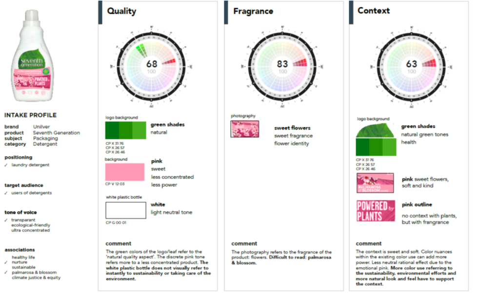
Customer case Unilever Seventh Generation. In addition to consumer research to evaluate existing and new packaging, a colour audit gives the associations of the current colours used.
In the search for the most impactful packaging, we are now moving away from expensive and long research processes. For example, we combine consumer research with predictive eye-tracking and colour science to validate whether the packaging stands out sufficiently and whether the most important elements receive attention. Based on more than 20,000 experiments, 1.6 million eyetracking data points and a smart AI algorithm, our efficient technology solution is able to predict what people are looking at during the first 3 key seconds of exposure to a stimulus, with an accuracy of more than 90%. This allows us to iteratively, quickly test and optimize different executions.
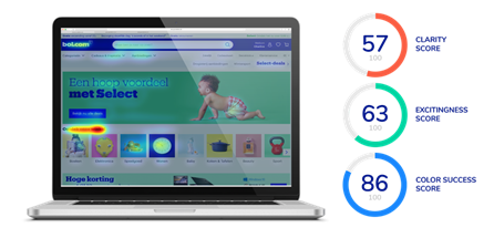
Prediction Intelligence engine. A combination of predictive eye tracking & colour expertise indicates the performance of visual communication.
Colour as an implicit research tool for segmentation and concept development
Finally, we also inject the richness of colours into segmentation and concept research. Based on intuitive and unconscious colour preferences, we can segment consumers and link them to brand personas, or give input to marketing and R&D which functional and emotional benefits a concept should play out and which visual colour identity should be associated with it.
For example, research shows that people generally classify wine into 2 categories: on the one hand, you have wine that is rich and complex in taste, that is consumed on special occasions or goes well with specific dishes. This wine is usually slightly more expensive. On the other hand, you have wine that is softer in taste, accessible, to drink together with friends and whose price is a bit cheaper. Depending on the desired product or brand positioning, you as a winemaker can therefore respond to it by using the right colours in all touchpoints, including the labels on the bottles. Just look at the wine bottles and the colours of the labels in the customer case for a wine producer. Consumers believe that the quality perception, taste intensity and price expectation of the wines in the 'High End' concept exceeds the one of the 'Commercial' wines. However, if you want to be accessible and uncomplicated as a brand or product, the 'commercial' labels are the best option.
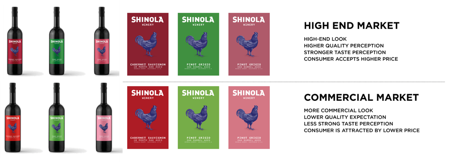
Customer case Wine producer. Based on colour choices in a concept description, associations and corresponding colours are automatically linked to the concept.
Jasper Scheir en Wim Hamaekers, Founders One Inch Whale
Thierry Lescrauwaet, Founder Color Navigator
Colours make the difference
It should be clear that colours make the difference. When we connect colour expertise and market research, we achieve better results. The right choice of colours and colour combinations leads to a stronger visual identity, a greater impact on the consumer and positive results for brands in the long term.
Do you want to know how the right use of colour
in branding and communication leads to more impact?
Get tips & tricks in our free webinar 'Research Visual Nudging' on the 18th of April 2023.