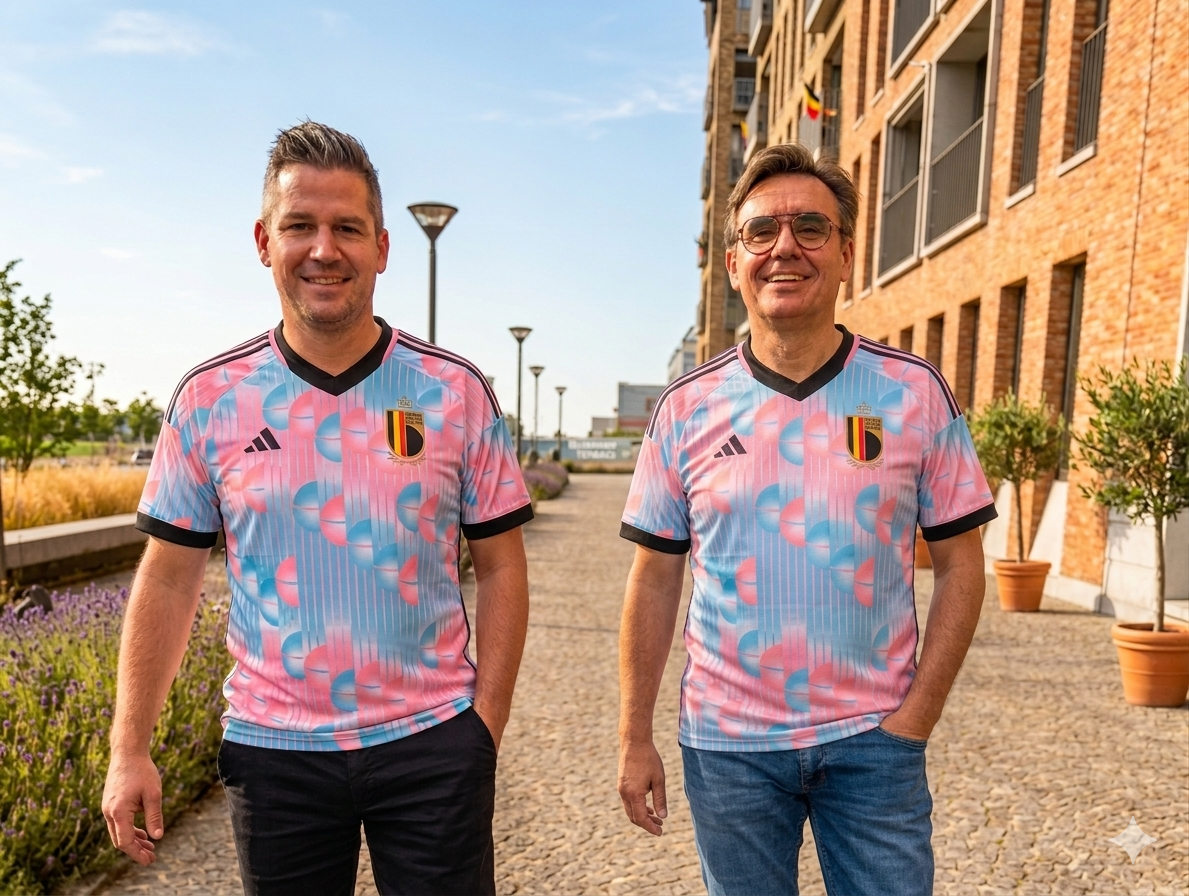
During a World Cup or European Championship, Belgium briefly feels like a single story. Streets turn black, yellow and red, and the Red Devils become a national symbol that brings almost everyone together. That is precisely why their new, lighter away kit has sparked so much discussion. Because when a strong brand touches one of its most recognisable characteristics, the conversation is rarely just about design.
The Red Devils' new football shirt has certainly got people talking. Not because supporters have suddenly become fashion critics, but because colour plays a much bigger role than we often realise. It is no coincidence that the Red Devils provoke this kind of debate. In a country where national unity is rarely a given, they remain one of the few symbols that almost everyone can rally behind during major tournaments.
The Red Devils may well be the strongest brand in the country. That is exactly why their strikingly lighter shirt has generated such strong
This image was created using AI
reactions. For years, supporters expected a powerful deep red. Today, softer shades and pastel influences have entered the picture. Some see this as modern and refreshing. Others feel it takes away from the character associated with the nickname "Red Devils". From a branding perspective, that reaction is hardly surprising.
Colour is never just colour
Colour is one of the most powerful recognition tools a brand possesses. Long before someone notices a logo or reads a message, colour has often already made an impression. And not every shade tells the same story.
Deep red is associated with strength, passion, energy and confidence. Lighter shades tend to feel more approachable, softer and more contemporary. When a brand lightens its colour palette, it is not only changing its design. It is also changing perception. A bold statement becomes more subtle. The same colour suddenly tells a different story.
Why change can feel uncomfortable
The debate is not really about a football shirt. It is about recognisability. In branding, these recognisable characteristics are often referred to as distinctive brand assets: colours, symbols and shapes that people immediately associate with a brand. Think of Coca-Cola's red or IKEA's blue and yellow. You do not even need to see the brand name to know who they belong to.
For many supporters, the same is true of the Red Devils' red. It is the colour of World Cups, European Championships, packed pubs and those rare moments when the entire country supports the same team. It represents memories, victories and moments of national unity. When such a recognisable element changes, some people feel as though a small part of that identity changes with it.
Evolving without losing yourself
None of this means that strong brands should never change. Quite the opposite. Brands need to evolve with the times. But the strongest brands understand which elements
are essential to their recognisability. They innovate from within their identity, not at the expense of it.
The discussion surrounding the Red Devils perfectly illustrates the tension between evolution and consistency. Strong brands are not built solely on what people see. They are built on what people remember. And when a country only occasionally declares allegiance to a single colour, every shade becomes noticeable.
Perhaps that is the real lesson behind the debate surrounding the Red Devils' away shirt. The strongest brands are not built on what they constantly change, but on what people instantly recognise. Innovation matters. But understanding what you should never lose is often even more important. Allez allez, Belgium!
Want to build a strong brand too? Start not by asking what needs to change, but by asking what is so valuable that your audience would immediately miss it if it disappeared.